MOBILE-FIRST RESPONSIVE DESIGN
GRID
MOBILE-FIRST RESPONSIVE DESIGN
GRID

Project Overview
Project Overview
Problem
Busy individuals crave the control and satisfaction of manual coffee brewing, but feel overwhelmed by information and lack time for extensive research. This makes it difficult to learn various brewing methods and find the perfect fit for their preferences and lifestyle.
Solution
A digital platform that allows users to dive deep into specific modules for a mastery of a particular skill, or skim the surface of broader topics. The adaptable platform caters to a variety of learning styles, ensuring an enriching and enjoyable experience for every coffee enthusiast.
In recent years, there's been a growing interest in manual coffee-making, despite time-saving options. This trend highlights a desire for control, quality, and customization in brewing. To create products that meet these needs, it's crucial to understand what drives this preference for learning manual methods.
Problem
Busy individuals crave the control and satisfaction of manual coffee brewing, but feel overwhelmed by information and lack time for extensive research. This makes it difficult to learn various brewing methods and find the perfect fit for their preferences and lifestyle.
Solution
A digital platform that allows users to dive deep into specific modules for a mastery of a particular skill, or skim the surface of broader topics. The adaptable platform caters to a variety of learning styles, ensuring an enriching and enjoyable experience for every coffee enthusiast.
Timeframe: 6 weeks
Timeframe: 6 weeks
Role: User Research, UX Design, Concept, Art Direction, Interaction, Wireframing, Prototype & Testing
Role: User Research, UX Design, Concept, Art Direction, Interaction, Wireframing, Prototype & Testing
Team: Individual conceptual case project
Team: Individual conceptual case project
Framework: IDEO's Design Thinking
Framework: IDEO's Design Thinking

Image: Current Website Pages
Image: Current Website Pages
User Interviews
User Interviews
Understanding user needs, preferences, and goals for e-learning and manual coffee-making
To create a tailored learning experience, I conducted six casual interviews with coffee enthusiasts of varying skill levels who regularly use manual brewing methods. These interviews aimed to gain a deep understanding of their motivations, preferences, and experiences with both manual coffee-making and digital learning platforms.
Image: Gaining insights with Affinity Mapping
Image: Gaining insights with Affinity Mapping
Proto-Persona
Proto-Persona
Designing for the novice brewers
User interviews revealed two distinct groups based on coffee-making experience: novice brewers with limited exposure to manual methods and experienced brewers with a wider range of knowledge.
This case study focuses on the novice group to understand their specific needs and challenges in the world of manual coffee brewing.
“Everyone's learning journey is different.
We all have different
starting points and paces."
“Everyone's learning journey is different. We all have different starting points
and paces."
Jamin L., a casual french press enthusiast
Jamin L., a casual french press enthusiast
User Flows
User Flows
Creating a visual representation of how to complete a course
After creating a sitemap to understand what sort of information was needed to create a minimal viable product (MVP), I created a prioritized feature list using the MoSCow method.
I developed 3 different user flows to represent the overall learning experience.
Course Selection
Course Purchase
Complete a lesson
In the example below, I focused on completing a lesson. This flow will address the user's experience in completing a lesson inside a module.


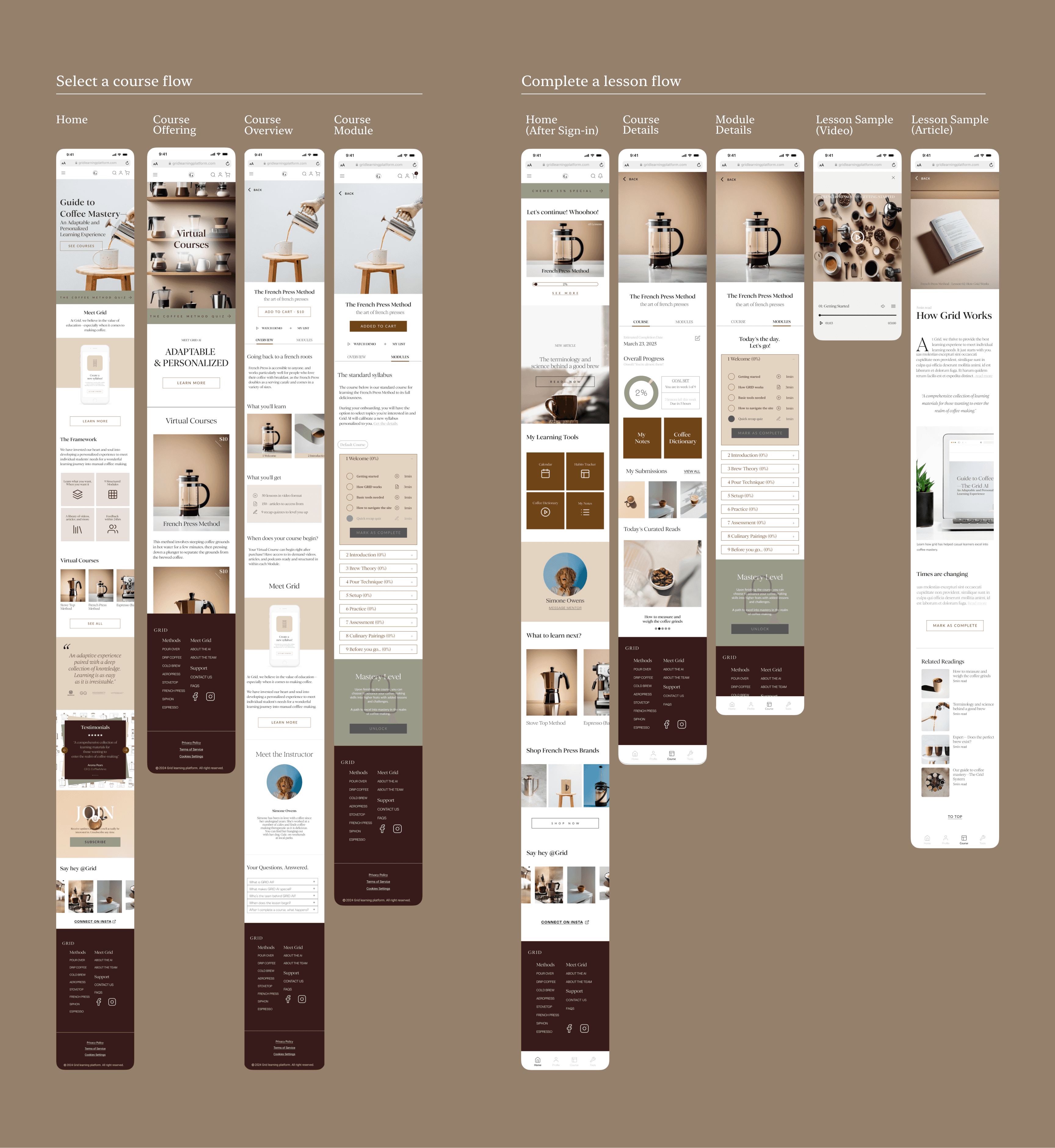
Image: User flow for completing a lesson
Image: User flow for completing a lesson
Wireframes
Wireframes
Empowering users to customize and take control of their learning journey
After creating the user flows to ensure my platform focused on the core functionalities needed for users to complete a course. These flows involved browsing, enrolling, and engaging with the learning content.
To cater to diverse user interests and preferences, the design prioritized personalization and adaptability, allowing users to customize their learning journey within the course.
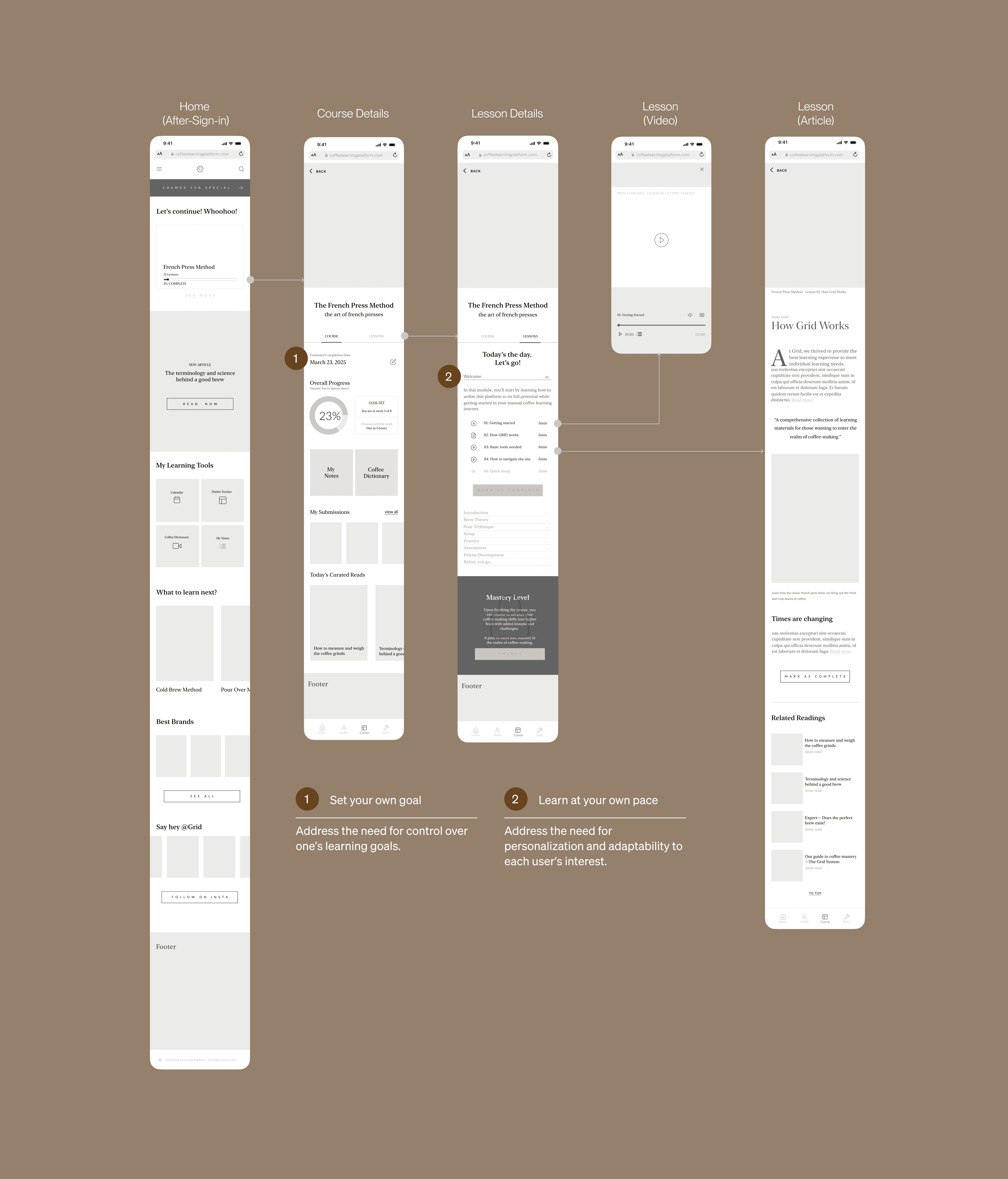
Image: Mid-Fidelity Wireframe for completing a lesson
Image: Mid-Fidelity Wireframe for completing a lesson
Usability Testing
Usability Testing
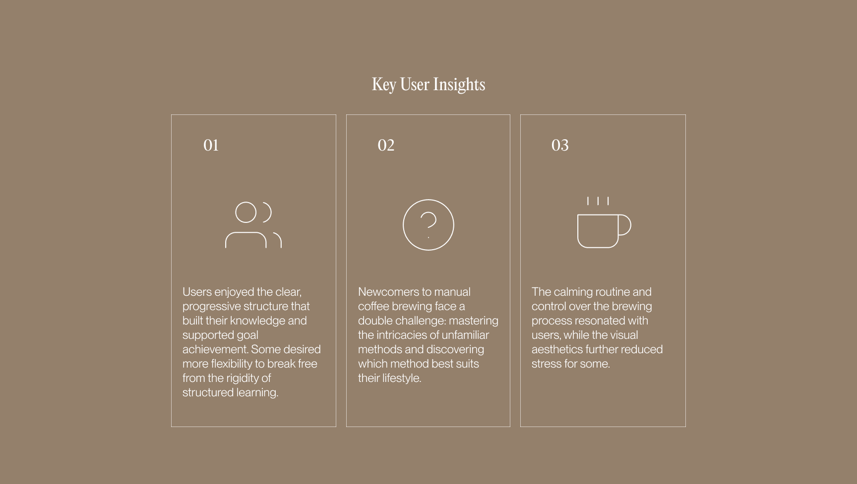
Utilizing test results to iterate on unexpected new findings
Usability testing showed users grasped the platform's purpose within 7 seconds on the homepage. Positive feedback included recalling the terms "adaptable," "testimonials", as well as the overall design (color, organization, layout) for being appealing and memorable.
However, in the second part of the test, only 1/5 of the users were able to complete the task. So what went wrong?
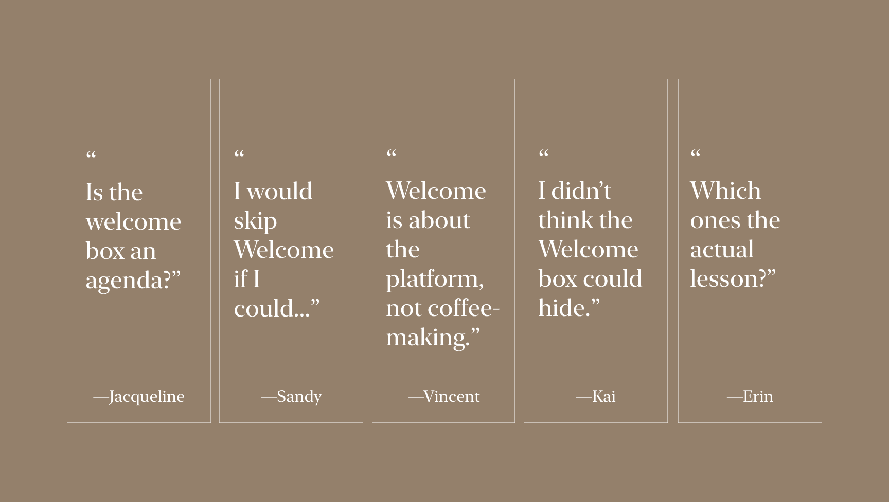
Image: Usability Testing Insights
Image: Usability Testing Insights
Iteration
Iteration
Identifying and addressing design flaws
Usability testing revealed the 'Welcome Box' hindered user flow. To understand why, I explored user perception of course hierarchy (course, module, lesson) and how it impacted task completion. This led to revamping the accordion content and design to align with best practices and enhance intuitiveness.
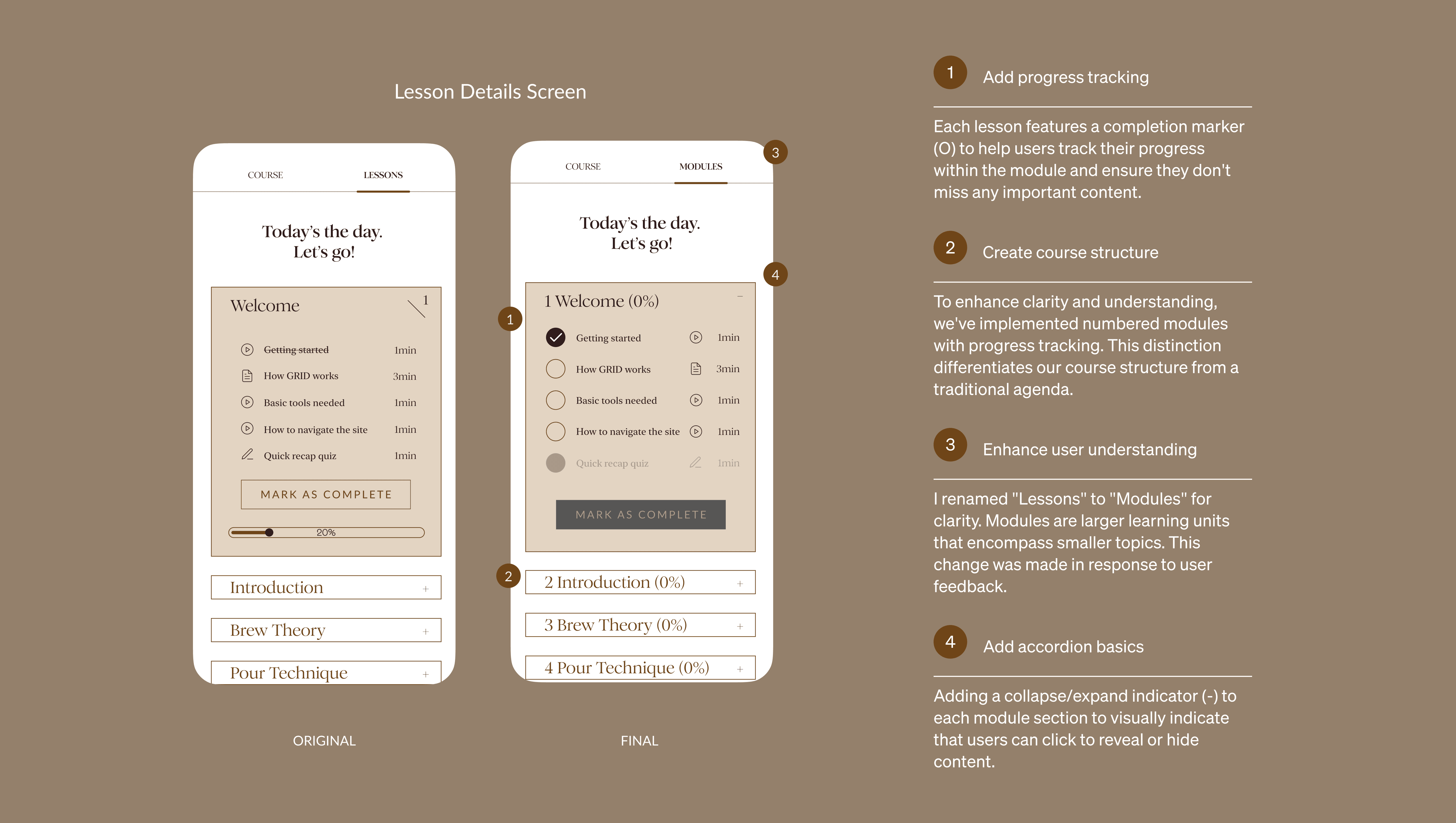
Image: Iteration of the design flaw
Image: Iteration of the design flaw
Visual Branding
Visual Branding
Expressing the product's core values with design
Learning can be both fun and stressful at times. By prioritizing user experience, I designed a soothing interface with clear visuals to combat information overload and create a calming learning environment. Calming color palettes evoke the coffee experience and create an earthy feel, while the editorial-style typography showcases knowledge, similar to a news site.
Expressing the product's core values with visual design
Learning can be both fun and stressful at times. By prioritizing user experience, I designed a soothing interface with clear visuals to combat information overload and create a calming learning environment.
Calming color palettes evoke the coffee experience and create an earthy feel, while the editorial-style typography showcases knowledge, similar to a news sites.
Expressing the product's core values with design
Learning can be both fun and stressful at times. By prioritizing user experience, I designed a soothing interface with clear visuals to combat information overload and create a calming learning environment. Calming color palettes evoke the coffee experience and create an earthy feel, while the editorial-style typography showcases knowledge, similar to a news site.
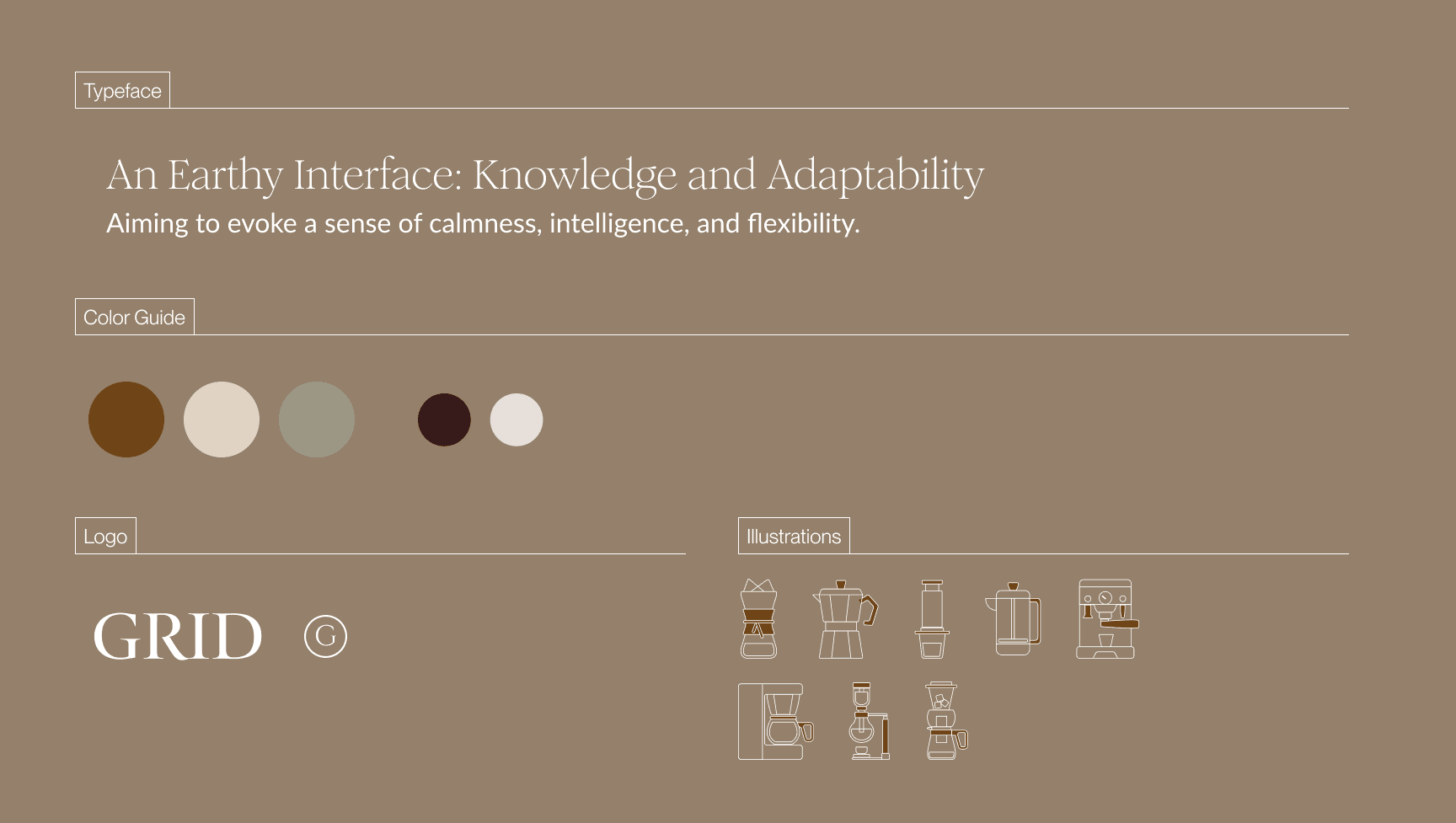
Image: Style tile
Image: Style tile
Final Design
Final Design
Finalizing the coffee learning experience
While I meticulously planned and designed this project, usability testing revealed some unexpected challenges. It was both humbling and energizing, as a designer, to receive feedback that will elevate the user experience beyond my initial vision.
Finalizing the coffee learning experience
While I meticulously planned and designed this project, usability testing revealed some unexpected challenges. It was both humbling and energizing, as a designer, to receive feedback that will elevate the user experience beyond my initial vision.
Add to Cart
Add to Cart
Allowing users to understand the product in 7-seconds
A brief 7-second homepage test revealed that users quickly understood the product and services offered. Positive feedback on the design, including comments on the colors and imagery, demonstrated the effectiveness of the design.
Making sure users understood the product in 7-seconds
A brief 7-second homepage test revealed that users quickly understood the product and services offered. Positive feedback on the design, including comments on the colors and imagery, demonstrated the effectiveness of the design.
Payment Flow
Payment Flow
Creating a seamless purchase experience
The usability testing results were highly positive, with minimal adjustments required. Users frequently expressed satisfaction with the design, often stating that it met their expectations.
Creating a seamless purchase experience
The usability testing results were highly positive, with minimal adjustments required. Users frequently expressed satisfaction with the design, often stating that it met their expectations.

Web Responsiveness
Web Responsiveness
Taking the mobile-first approach to web responsive design
Adopting a mobile-first approach involved starting with the mobile experience and gradually adding features and complexity for larger screens. The design incorporated more visuals while preserving the core values of Grid: adaptability and knowledge.

Reflection
Reflection
What I learned:
This project was particularly engaging due to my personal interest in coffee. The constraint of designing first for mobile presented a unique challenge, as it differed from my previous experience designing for web and then adapting to mobile.
What I would do next time:
With additional time, I would have conducted another round of usability testing to validate the new Grid iteration. In the context of e-learning, understanding how users learn and process information in today's technology-driven world is crucial.
Final Prototype
Final Prototype
Time constraints led me to usability test the high-fidelity prototype, refining the mid-fidelity wireframes before doing so.
Time constraints led me to usability test the high-fidelity prototype, refining the mid-fidelity wireframes before doing so.
SEE PROTOTYPE