RESPONSIVE WEB REDESIGN
Blanton Museum of Art
RESPONSIVE WEB REDESIGN
Blanton Museum of Art


Project Overview
Project Overview
The Blanton Museum (est. 1963) has a 21,000-piece collection emphasizing Latin American art. However, declining website traffic and rising competition suggest an opportunity to uncover and improve its online presence.
The Blanton Museum (est. 1963) has a 21,000-piece collection emphasizing Latin American art. However, declining website traffic and rising competition suggest an opportunity to uncover and improve its online presence.
Timeframe: 6 weeks
Timeframe: 6 weeks
Role: Research, Interaction, Wireframing, UX Design, Prototype & Testing
Role: Research, Interaction, Wireframing, UX Design, Prototype & Testing
Team: Individual conceptual case project
Team: Individual conceptual case project
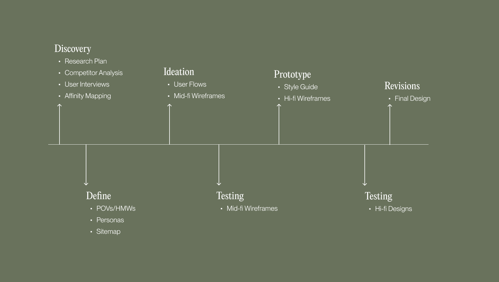
Image: Current Website Pages
Image: Current Website Pages
Background
Background
The Blanton Museum (est. 1963), located on the University of Texas campus, has a loyal local audience but faces declining web traffic amid increasing competition. To attract more visitors, we’ll take a look into the museum online strategies to see where improvements can be made.
The Blanton Museum (est. 1963), located on the University of Texas campus, has a loyal local audience but faces declining web traffic amid increasing competition. To attract more visitors, we’ll take a look into the museum online strategies to see where improvements can be made.
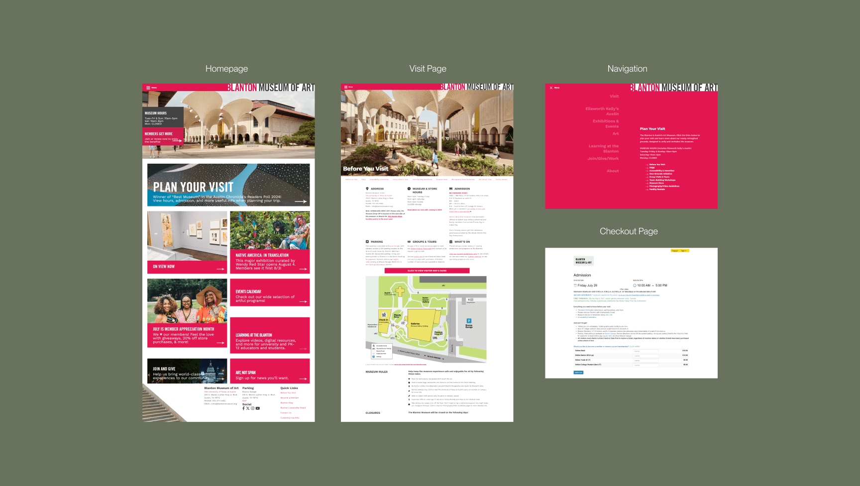

Image: Current Website Pages
Image: Current Website Pages
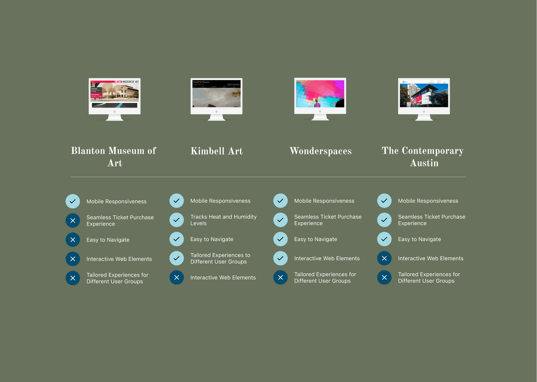
Competitive analysis
Competitive analysis
Research yielded a lack of interactive site elements, accessibility and inclusivity
To identify potential competitors, I analyzed three institutions: the Kimbell Art Museum, Wonderspaces, and The Contemporary Austin. These organizations were selected based on their focus on art, culture, and immersive experiences.
Image: Comparing competitors and their websites
Image: Comparing competitors and their websites
Heuristic Evaluation
Heuristic Evaluation
The analysis revealed needed improvements for the navigation, forms, and ui elements
In this evaluation, I analyzed the current website's primary navigation links, focusing on areas identified during user interviews. The analysis revealed a misalignment between business objectives and customer interests, as the website prioritized content over user needs.
“I like to picture how my experience will be.
It’s not just to look at art,
but how it feels,
how things look in the space I’ll be in.”
“I like to picture how my experience will be.
It’s not just to look at art,
but how it feels,
how things look in the space I’ll be in.”
Amanda K., A Painter
Amanda K., A Painter
User Interviews
User Interviews
Interviews revealed the opportunities that influence online ticket purchases
The primary objective of these interviews was to enhance the Blanton Museum of Art's visitor experience. By examining the online interactions, I aimed to understand visitor motivations, preferences, and behaviors.
I sought to identify opportunities to improve the museum's website and in-person experience by gathering insights from local residents, out-of-state tourists, and international visitors whom were interested in art.
Image: Gaining insights with Affinity Mapping
Image: Gaining insights with Affinity Mapping

Proto-Personas
Proto-Personas
Selecting the user group with a focus on accessibility and inclusivity
Affinity mapping revealed two distinct user groups among first-time museum website visitors: art enthusiasts and family-focused art lovers. While both groups shared a passion for art, parents specifically sought family-friendly experiences. This insight highlighted the need to cater to the unique needs of parents seeking to share their love of art with their children.
“Planning for an entire family can be hectic.
I need to be prepared
so that everyone, especially my kids,
can learn and have a good time."
“Planning for an entire family can be hectic.
I need to be prepared
so that everyone, especially my kids,
can learn and have a good time."
The Artful Parent
The Artful Parent
Problem
Problem
Given the Blanton Museum of Art's substantial online traffic, enhancing offerings for families, particularly those with diverse interests and age groups is crucial to creating more enjoyable and memorable experiences for all.
Given the Blanton Museum of Art's substantial online traffic, enhancing offerings for families, particularly those with diverse interests and age groups is crucial to creating more enjoyable and memorable experiences for all.
Solution
Solution
Redesign the website to implement inclusive elements that cater to the needs of all family members, while ensuring accessibility for individuals of all ages and abilities.
Redesign the website to implement inclusive elements that cater to the needs of all family members, while ensuring accessibility for individuals of all ages and abilities.
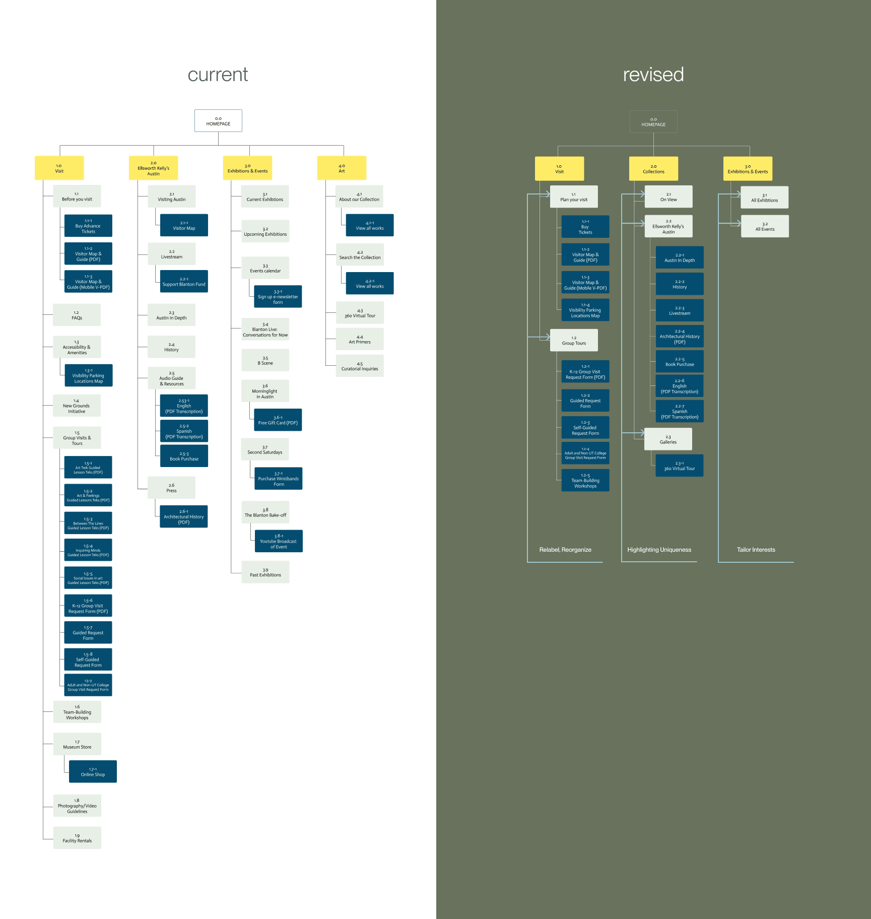
Image: Redesigning the sitemap focused on first-time visitors
Image: Redesigning the sitemap focused on first-time visitors
Wireframing
Wireframing
Designing a user flow that impacted the purchase design for first-time visitors
To improve the website, I focused on redesigning the sitemap and analyzing its impact on first-time visitor purchases. While other sections are important, I prioritized the purchase decision process in this redesign.
Designing a user flow that impacted the purchase design for first-time visitors
To improve the website, I focused on redesigning the sitemap and analyzing its impact on first-time visitor purchases. While other sections are important, I prioritized the purchase decision process in this redesign.
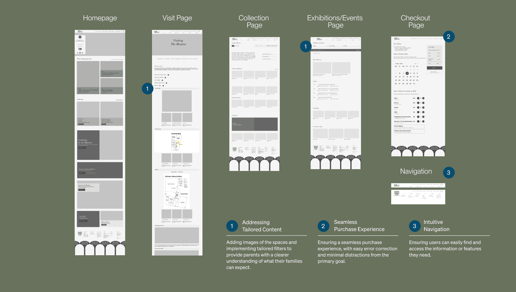
Image: Lo-Mid Fidelity Wireframe
Image: Lo-Mid Fidelity Wireframe
Visual Branding
Visual Branding
Creating a more inviting atmosphere: Color palette and logo update
To prioritize user experience, I retained the current site's typeface choices and adopted the new logo, previously used only on the form page. While I initially considered retaining the original color scheme, user interviews highlighted a preference for a more welcoming atmosphere. The new logo's color palette, featuring a calming blue and a vibrant yellow, helps achieve this while also ensuring accessibility for all users.
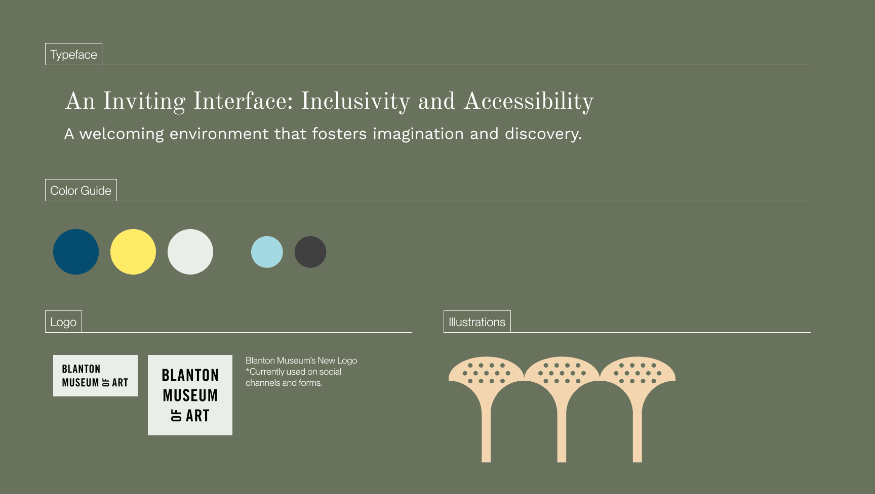
Image: Simplified Style Guide Utilizing Museum's New Logo
Image: Simplified Style Guide Utilizing Museum's New Logo
Prototype
Prototype
Viewing the final prototype
After conducting user testing, I developed a prototype showcasing key features designed to attract a wider audience. The prototype highlights the museum's need to improve its website and adapt to the growing demand for responsive design.
Viewing the final prototype
After conducting user testing, I developed a prototype showcasing key features designed to attract a wider audience. The prototype highlights the museum's need to improve its website and adapt to the growing demand for responsive design.
Usability Testing
Usability Testing
Iterating and improving designs
User Testing was conducted to evaluate the functionality and user experience of the low-fidelity wireframes. The study focused on answering the following:
1.) Assess the overall ease of use and effectiveness of the website’s ticket purchase flow.
2.) Identify any usability issues or obstacles that hinder the user experience (eg: navigation, purchase flow)
3.) Determine the key features and functionalities that participants value in the key screens shown

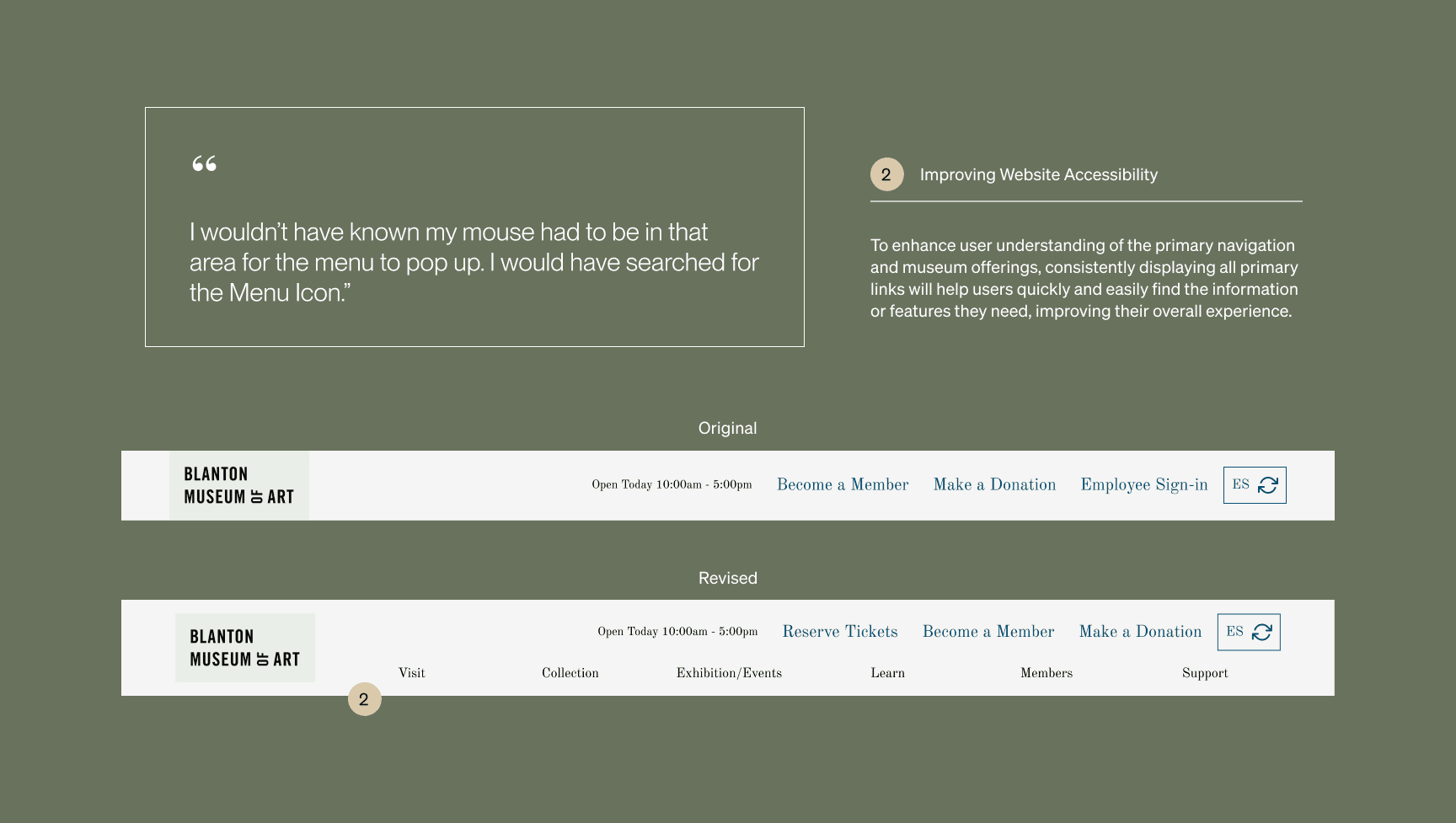
Image: Implementing Usability Testing Insights
Image: Implementing Usability Testing Insights
Homepage Redesign
Homepage Redesign
Prioritizing accessibility: Color, text, and language
To enhance accessibility, I added features that cater to diverse users, including light/dark mode and adjustable text size. These features ensure a more inclusive experience for locals, out-of-state visitors, and international users.
To cater to the local Spanish-speaking population, I added a Spanish language option. This feature ensures a more inclusive experience for Austin residents.

Ticket Purchase
Create a seamless purchase experience
While I meticulously planned and designed this project, usability testing revealed some unexpected challenges. It was both humbling and energizing, as a designer, to receive feedback that will elevate the user experience beyond my initial vision.
Ticket Purchase
Creating a seamless purchase experience
While both user interviews and heuristic evaluations identified challenges in the purchase experience, redesigning the form for improved clarity and comprehensiveness can help alleviate potential misunderstandings.

Collection Page
Collection Page
Designing an intuitive navigation while highlighting other aspects of the museum
To enhance user experience, the project prioritized improved navigation. User feedback highlighted the need for consistently visible navigation elements. Additionally, the museum's architecture and notable artworks were emphasized to attract a wider audience.

Exhibitions and Events Page
Exhibitions and
Events Page
Exhibitions and
Events Page
Addressing user pain point by creating a tailored experience with filters
To understand the needs of family visitors, I interviewed parents and focused on their preferences for age-appropriate activities and events. This revealed a desire for features that would help them choose suitable experiences for their entire family, including young children and seniors.

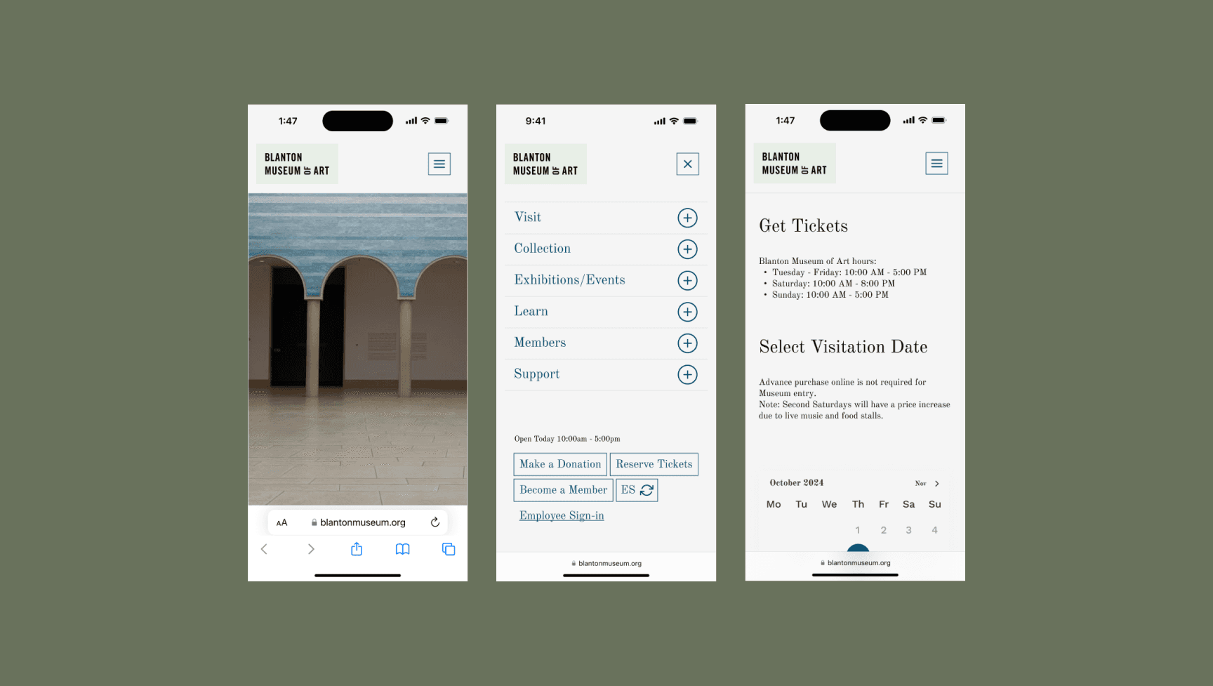
Mobile Responsiveness
Mobile Responsiveness
Designing a more intuitive interface for mobile users
To improve the user experience, the redesigned website features a more responsive layout, compacted navigation, and a vertical scroll format for the purchase form. These changes optimize the browsing experience for mobile users.
Designing a more intuitive interface for mobile users
To improve the user experience, the redesigned website features a more responsive layout, compacted navigation, and a vertical scroll format for the purchase form. These changes optimize the browsing experience for mobile users.
Reflection
Reflection
What I learned:
While my personal visit to the Blanton Museum inspired this project, I recognize the importance of considering various stakeholders beyond just visitors. To further enhance the design, I recommend conducting broader interviews and incorporating accessibility features like those seen in other art museums worldwide. This will help ensure the website caters to a diverse audience.
What I would do next time:
While visiting the Blanton Museum, I realized that improving the website could benefit a wider range of stakeholders, not just visitors. To further enhance the design, I would conduct interviews with additional stakeholders. This would even impact the current navigation and give it more meaning and relevancy.