A mobile-first responsive coffee learning platform

Project Overview
Role
UX/UI Designer
Timeline
8 Weeks
Contribution
UX/UI, Research, Visual, Interaction, Wireframing, Prototyping, Testing
Framework
IDEO, Design Thinking
Problem
Coffee drinkers new to manual brewing find it difficult to learn how to make coffee and choose the right method.
Solution
A flexible platform for coffee lovers to learn about various coffee-related topics and brewing methods.
Key Features
1
Personalization with the flexibility of module layout
Users wanted a structured learning experience but also flexibility to skip topics.
2
Coffee Method Quiz to encourage the right lifestyle fit
Users had to try different methods to find the best one for them.
3
Mastery Prompt lets users strive to unlock new content
Users said it would be nice to have a way to stay motivated while learning.

USER GOALS
Find a Personalized Brewing Method:
Users seek personalized recommendations that suit their lifestyle, tools, and taste preferences.
Balance Structure with Flexibility:
Learners want both guided lessons and the freedom to explore topics at their own pace.
Stay Motivated While Learning:
Users are drawn to systems that reward progress and help them feel a sense of achievement.
BUSINESS GOALS
Build a Loyal Community Around Coffee Education:
Attract coffee enthusiasts and foster retention through personalization, interactivity, and progress-based motivation.
Position Grid as a Trusted Learning Brand:
Build credibility with a thoughtful, organic visual identity and expert-driven content.
Monetize Learning with Tiered Content:
Create free and premium content to turn engaged learners into paying customers.
IMPACT
Grid bridges the gap between curiosity and confidence for manual coffee brewers. By combining structure with flexibility and layering in motivation through gamified features, Grid transforms an overwhelming learning journey into a personalized, enjoyable experience. It redefines coffee education as approachable, engaging, and rewarding—especially for users seeking alternatives beyond espresso.
Research
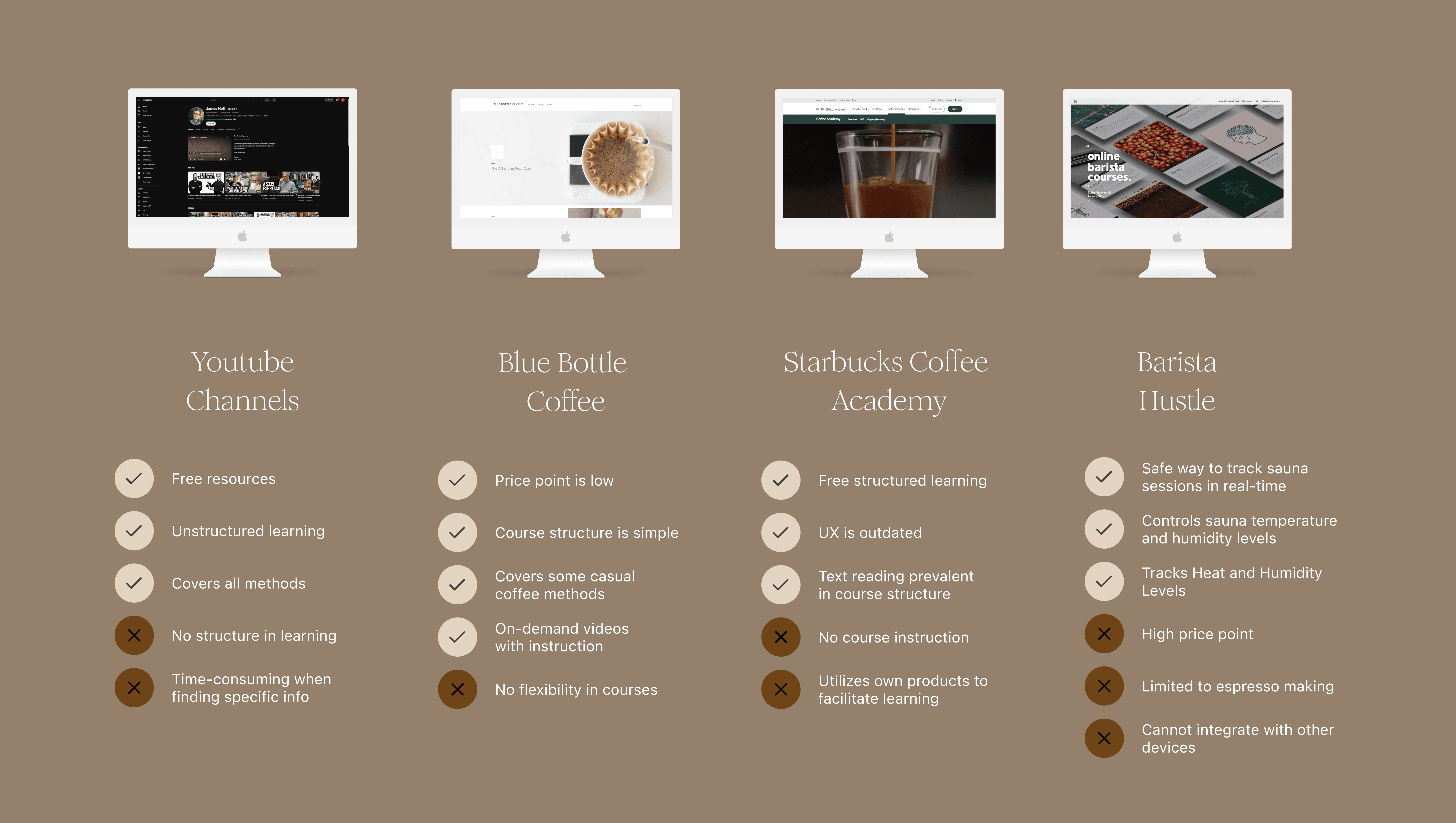
Competitive Analysis
This research informed me of three key insights that lacked in the market:
1
Rise in on-demand video content
Many online courses are trending towards videos instead of text.
2
Flexibility in structured learning
Most coffee learning sites have fixed lessons that you must complete in order.
3
More coffee-making methods
Most online coffee courses focus on espresso than other methods.
User Interviews
After interviewing 6 users, the research informed me of these key insights:
Key Insights
When structured learning becomes paid learning
Many users were willing to pay for courses if they couldn't easily find the information they needed.
Limited awareness of other coffee-making methods
New coffee makers often tried different methods to find what they liked.
Coffee-making is relaxing, esthetic, and satisfying
Users sought out manual methods because it was therapeutic and they felt in control of the process.
Visual media was most preferred when learning
Most people preferred learning from videos, then podcasts, and then articles.
"I like hopping around and learning different things."
Lulu L.
Stove Top Aficionado
“I'm a little bit of both. I need structure but also be able to dive into what I want to learn.”
Arno L.
Pour Over Party Pleaser
"Everyone’s learning journey is different."
Jamin L.
French Press Enthusiast
Proto-persona
This project will prioritize The Speedy Coffee Sipper for its development to differentiate current market product offerings outside of only espresso-making.
User Group 1
The Speedy Coffee Sipper

SELMA SANG
Age 28
Profession: Designer
Location: Manhattan, NY
MOTIVATIONS & GOALS
Impress friends and family with barista-quality coffee
WANTS & NEEDS
Recommendations for equipment and supplies
A supportive community of fellow coffee enthusiasts
Step-by-step guides and tutorials
PAIN POINTS
Frustration with courses that are too focused on espresso and lack variety in topics.
Overwhelmed by the vast amount of information available online
User Group 2
The Intentional Slow Pourer

CHASE WILKINSON
Age 21
Profession: Engineer Student
Location: San Fran. CA
MOTIVATIONS & GOALS
Deepen their knowledge of coffee brewing techniques
Understand science and art of coffee-making
WANTS & NEEDS
In-depth tutorials and guides on advanced brewing methods
Access to expert knowledge and insights from coffee professionals
PAIN POINTS
The high cost of trial-and-error of multiple methods
The challenge of translating theoretical knowledge into practical application
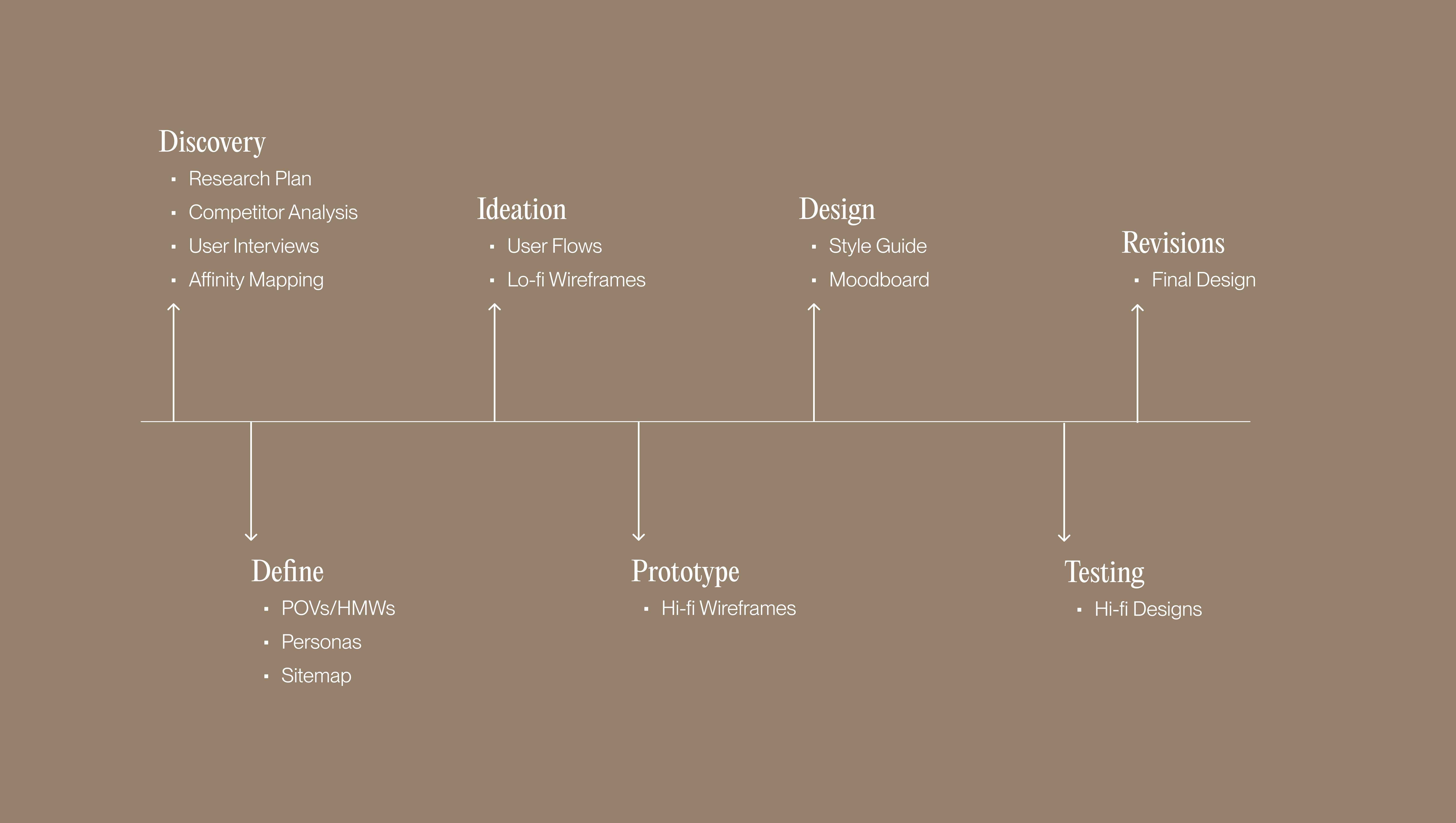
Design
User, Task and Wireflows
After creating a list of features and a sitemap, I prioritized 3 key flows in order to understand the early user experience: 1.) select a course, 2.) make a payment, and 3.) Go to a lesson.
1
Select a course
Constraint for this design:
How do I include one of the platform’s feature Coffee Method Quiz as part of a user’s purchase decision?

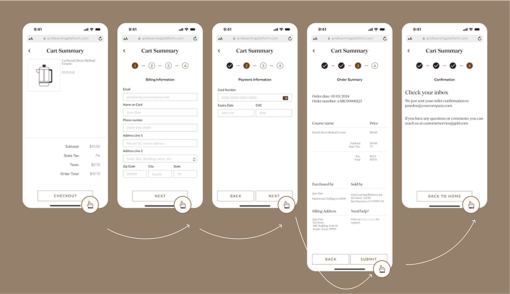
2
Complete a payment
From the design:
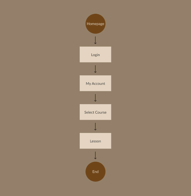
3
Go to a lesson
From the design:
How can it be flexible?
Wireframes
After creating a feature set and sitemap, I mocked up some wireframes.
Lo-Fidelity Wireframes
Design different layouts, content, and features
From the ideation:
Would using an accordion give users control?
Would the mastery prompt be understandable?
Mid-Fidelity Wireframes
Evaluate hierarchy, layout, and interaction flows
To the design:
Use accordion and add borders for grid layout
Add desciption to the mastery prompt feature


Visual Identity
Establish the unique brand identity for Grid.
1
Organic
Utilizing earthy colors to give a product a sense of authenticity.
2
Knowledgeable
Using editorial typefaces to give a sense of authority and wisdom.
3
Adaptable
Choosing design elements that give users control their learning.
Logo

Typeface
This is a subtitle
Color

Hi-Fidelity Prototype
After refining the mid-fidelity wireframes, I created a detailed version with the final look and feel.
Understanding the Early User Journey
Select a course
Awareness: Users actively evaluate different options and make decisions.
Make a payment
Purchase: Users make a final decision and complete the transaction.
Complete a lesson
Adoption: User starts using the product or service for the first time.


Test
Usability Testing
Time constraints led me to usability test the high-fidelity prototype, refining the mid-fidelity wireframes before doing so.
From the design:
Do users understand the purpose and value?
Different ways to understand the same feature
Testing user flows
Focus on user behavior and interaction
Questions to ask:
What is the website about?
What are its key product and features?
How useful are the features?

Iteration
After interviewing 5 users, the research informed me of these key insights:
Key Insights
Importance of Clear Terminology
When users were asked to complete a lesson, majority of users didn't understand what it meant within the screen of the design.
1
Edit the content switcher
Changing the text from Lesson to Module
2
Remove and replace the progress bar
Replace the progress bar with an indicator (0%) next to module names.
Preserving the Accordion Element
Many users didn't know they could click on the first module to open or close it. Some thought the modules were not interactive.
3
Use the accordion appropriately
Changing the top right of modules to +/-
4
Number the modules
Numbering the modules helps organize them visually.

Final Design
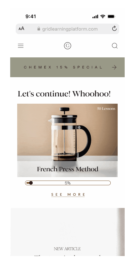
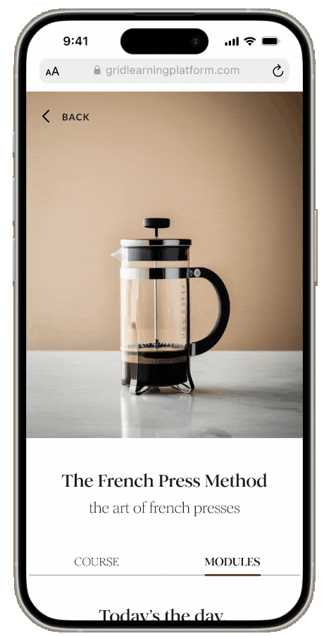
Grid is a mobile-first responsive coffee learning platform that lets you learn at your own pace.
1
Learning at one's own pace
2
Staying challenged, goal-oriented
3
Starting off at the right place
FEATURE 01
Flexible
Learning Structure
Addressing the need for structured videos and content that users can access anytime.

FEATURE 02
Mastery
Prompt Trigger
Addressing the need for delightful learning challenges and continuous engagement.

FEATURE 03
The Coffee
Method Quiz
Addressing the need for personalized recommendations.
Reflection
On information architecture (IA): I didn't know how helpful card sorting would be until I started designing. I originally used it to organize content, but I wish I'd used it to design the navigation too which didn't occur to me in the mobile-first approach.
Added Tools
Generative AI Image Tool (Visual Electric)
Use Case
Generating images to complement design
What I learned
After conducting a mandatory card sorting, I realized its intended purpose would have benefited in a smaller scope such as the navigation creation.
For next time
Incorporate card sorting to create a navigation structure that reflects the groupings and labels identified in the card sort.
Previous Project:


Next Project: