Project Overview
Role
UX/UI Designer
Timeline
8 Weeks
Contribution
UX/UI, Research, Visual, Interaction, Wireframing, Prototyping, Testing
Framework
IDEO, Design Thinking

Problem
Given the Blanton Museum of Art's declining online traffic, maintaining an online presence is crucial to connecting with visitors.
Solution
Redesign the website to implement inclusive elements that cater to the needs of families, while ensuring accessibility for individuals of all ages and abilities.

current


new
Key Features
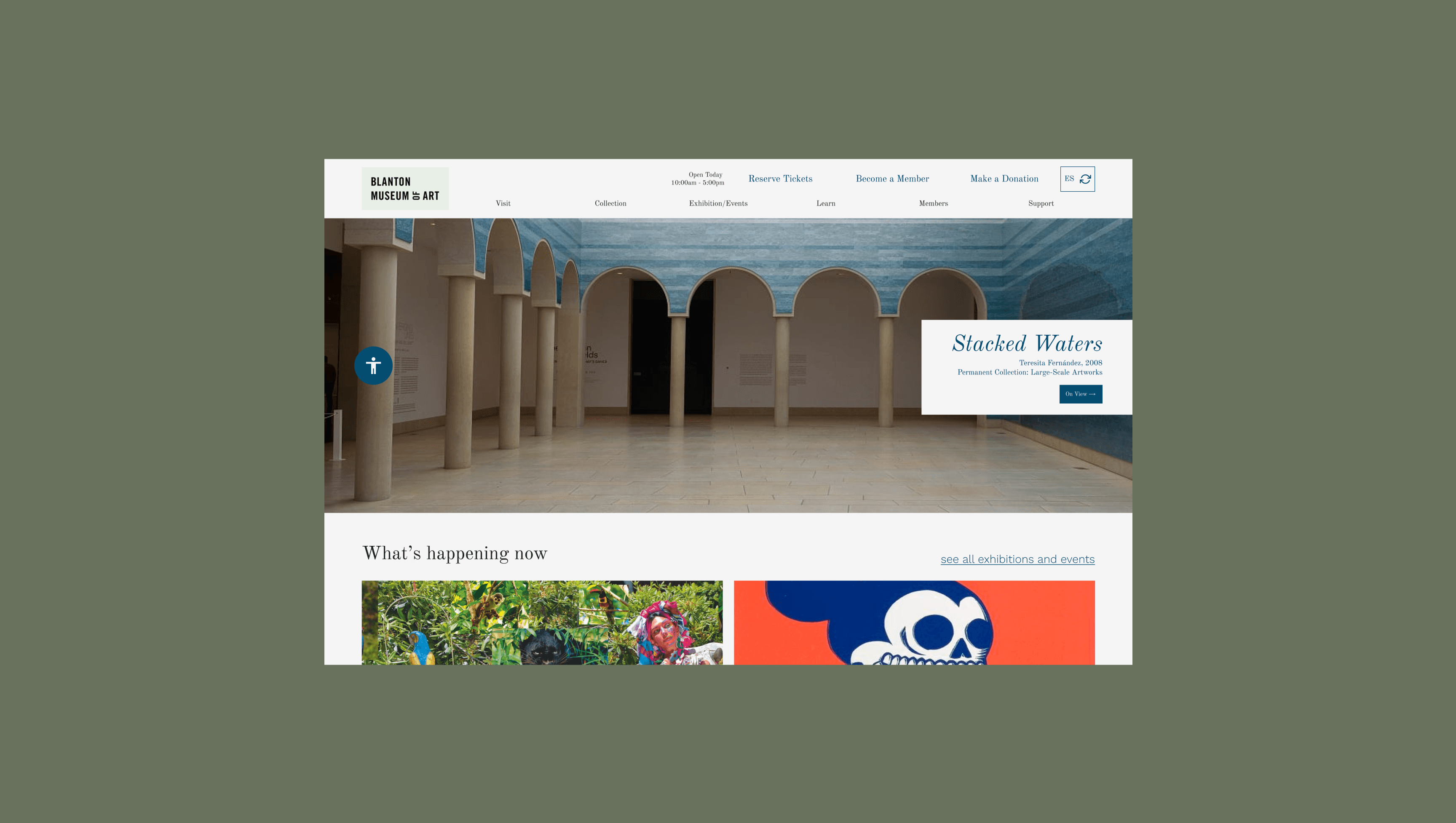
Redesigned navigation, relabeled and recategorized for intuitiveness
Users pointed out the current website was hard to navigate.
Accessibility panel to be more inclusive and attract more visitors
Users mentioned the colors were hard on the eyes.
3
Personalization utilizing filter browsing by date, audience, and interest
Users mentioned they wanted less text or better ways to find what they need.
4
Seamless ticket purchase to increase ticket sales
Users had trouble paying online and saw a different logo on the payment page.
USER GOALS
Browse by interest and age group:
Families, educators, and younger audiences seek events and exhibitions tailored to their needs.
Accessibly engage with content:
Users need legible design, adjustable colors, and an intuitive layout that doesn’t rely on hover states.
Enjoy a seamless ticketing experience:
Visitors expect a streamlined, trustworthy checkout process without errors or redirects.
BUSINESS GOALS
Enhance user engagement and retention:
Through intuitive navigation and personalized content that encourages exploration.
Strengthen brand trust:
By eliminating inconsistent design elements (e.g., conflicting logos, confusing buttons) to provide a cohesive digital experience.
Serve a wider, more diverse audience:
By implementing accessible and inclusive design that reflects the museum's values.
IMPACT
By aligning the redesign with both user and business goals, this project strengthens the Blanton’s ability to connect meaningfully with its audiences and
Support inclusivity and accessibility efforts
Improvements in navigation, accessibility, personalization, and ticketing flow are designed to:
Increase digital engagement
Boost ticket revenue
Support inclusivity and accessibility efforts
Reinforce the museum’s role as a modern, family-friendly cultural destination
Ultimately, the redesigned experience doesn't just serve visitors better—it empowers them to explore, engage, and return.
Research
Competitive Analysis
This research informed me of three key insights that lacked in the market:
1
Tailored experiences and services
Most museums have catered offerings for families, children, and seniors.
2
Seamless e-ticket purchase
Museums had an intuitive way to showcase admissions or special-priced events.
3
Clear, simple navigation menu
Museums were easy to navigate and find information quickly.
Heuristic Evaluation
This research informed me of three key insights that affected the website:
1
Inefficient design, no flexibility
Difficult to find specific information and understand the website's main features.
2
Form doesn't prevent mistakes
The ticket buying process was confusing, especially if users had to change the number of tickets.
3
Design system inconsistencies throughout
Use of different colors and styles for buttons, making it confusing to know what to click.

navigation

form

events page
User Interviews
After interviewing 5 users, the research informed me of these key insights:
Key Insights
Difficulty finding information
Most users couldn't find ticket information or specific events details.
Starting over when buying eTickets
100% of users had to start over when they made mistakes on the ticket form.
Sought out age-specific content
Users sought filters to find activities for specific ages.
Colors were harsh on the eyes
80% of users thought the pink was too bright. One person thought it was red.

Jaqueline W.
Interactive Art Lover and Mother
Mattie V.
Museum Enthusiast
Amanda K.
Painter and Mother
Proto-persona
This case study will prioritize The Artful Parent for its redesign to improve the website for families.
The Free-spirited Art Lover
JASPREET KAUR
Age: 23
Profession: Design Intern
Location: Houston, Texas
MOTIVATIONS & GOALS
Gain deeper knowledge about the art on display.
Learn about upcoming exhibitions, plan a visit to the museum
WANTS & NEEDS
Clear information about exhibitions but no spoilers
Ability to track progress and see immediate results
PAIN POINTS
Limited information about the permanent collection and date of visit
The Family-focused Artful Parent

CARMEN SANTIAGO
Age: 32
Profession: School Teacher
Location: Austin, Texas
MOTIVATIONS & GOALS
Find family-friendly activities and plan a fun and educational visit to the museum.
WANTS & NEEDS
Family-friendly activities, exhibitions and exhibits that are tailored to different age groups and/or families.
PAIN POINTS
Complex ticketing process for large families
Lack of interactive elements for all ages
Limited details about museum amenities and accessibility
Design I
Information Architecture
A sitemap was created to plan the new navigation, based on the feature list.
Design Constraint: Limit the scope to factors influencing first-time museum visitor experiences.
Current Sitemap
Understanding the current model
From the design:
What do users perceive when seeing the words, ‘Ellsworth Kelly’s Austin’ in the primary navigation?
What do users generally see first to determine their visit?

Revised Sitemap
Redesigning with a user-centered approach
Questions to consider:
In what ways can we highlight the museum’s key feature, ‘Ellsworth Kelly’s Austin’?
What part of the museum captures your attention first when visiting?
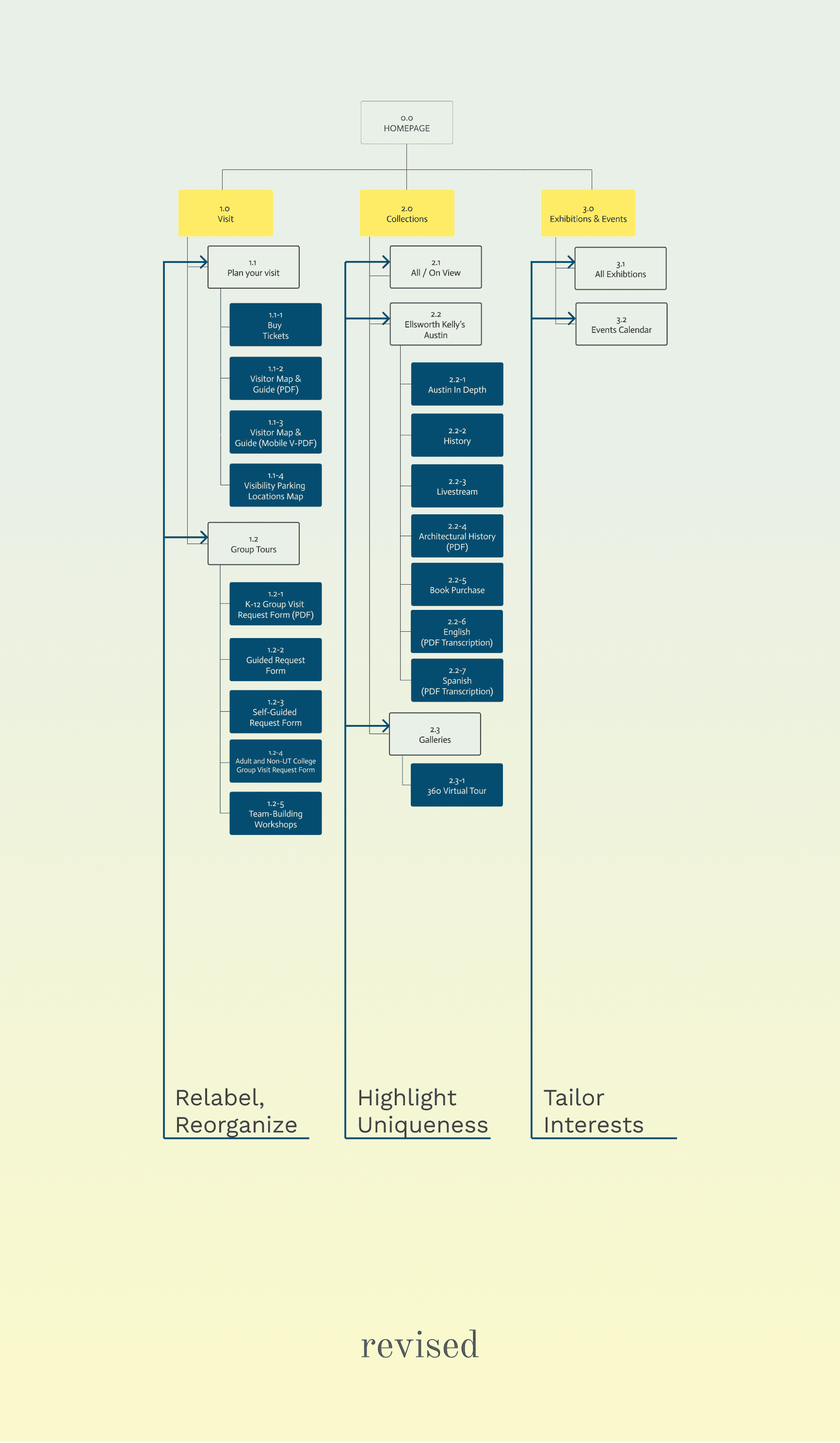
Click to enlarge
Wireframes
Designed layouts based on features, benchmarking reputable art museums.

Mid-Fidelity Wireframes
Experiment with different feature implementations and usage scenarios
From the design:
What do users understand about collections?
What do users think about when using filters?

User Testing
Investigate how users categorize information and use features
Questions to ask:
What do you think 'collections' means?
How would you use this filter to plan a trip to the museum?


Key Insights
Avoid hover elements
Users wanted control over elements like the menu without it disappearing.
Have specific categories
Users noted clearer categories would be helpful when filtering.
Better readability
Users found the accessibility panel helped improve visibility issues.


Design II
Visual Identity
Following the museum's current design system.
1
Elegant and
sophisticated
Uses clean lines, serif fonts, and a sophisticated color palette.
2
Diverse and
inclusive
Houses varying diverse collections, incorporating a variety of styles and periods.
3
Engaging and
inviting
Uses visuals, stories, and architectural additions to attract visitors.
Logo


Typeface
This is a headline
This is a subtitle
Color


Prototype
After receiving user feedback on features and concept,
I focused on the key user flows: plan a trip using the filter and purchase an eTicket.
Hi-Fidelity Prototype
Knowing how to use the product's primary features.
From the design:
What can users expect from the filter?
How can we improve the checkout process?
Usability Testing
Examine what is wrong throughout the user experience
Questions like:
Use the filter to find activities for you and a child
How can you book your trip online?
Iteration
After testing 5 users, the research informed me of these key insights:
Key Insights
Adjust Sitemap
Most users missed the filter in the 'Exhibitions/Events' page.
1
Move and relabel, "Events Calendar"
All users were originally driven to 'All Events' hoping to find the filter there.
2
Give a timeframe snapshot to compare
By selecting a single date, users can get a snapshot within a similar timeframe.
Adjust Filters
Some users wanted to use the filter to find events and relevant activities.
3
Adjust browsing options to meet different interests
Adjust categories of 'Who' and 'What' with a focus on audience type and interests
4
Bring focus to specific details
Add category tags listed in the filters while providing more information.

before

after
Final Design
The Blanton Museum needs a redesign to stay relevant and accessible.
1
Deeper Exploration

INTUITIVENESS
Revised Navigation
Addressing the need to find information more efficiently and without frustration.
2
Easy Event Discovery
PERSONALIZATION
Drop-down Filters
Addressing the need to find events of interest based on specific criteria like when, who or what.
3
Better Visibility

ACCESSIBILITY
Light and Dark Mode
Addressing the need to improve the browsing experience for those with visual impairments.
4
Simple Booking
USER-CENTERED
Seamless Purchase Experience
Addressing the need to improve the purchase experience for all users.
Reflection
On accessibility and inclusivity: During user interviews, I discovered an interesting trend: while users initially found the bold pink appealing, they later reported eye strain.
Added Tools
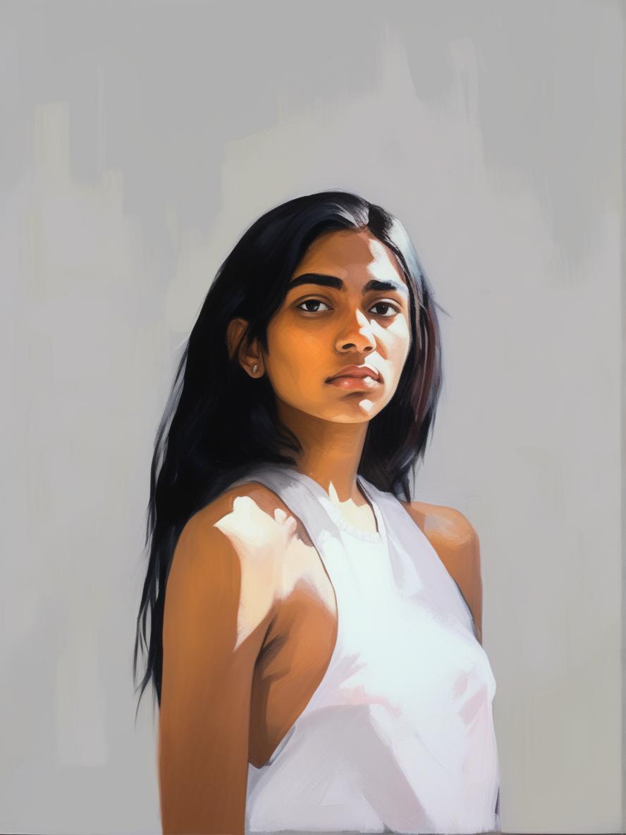
Generative AI Image Tool (Visual Electric)
Use Case
Create persona images for the museum
What I learned
I learned that color perception can vary widely. One user even saw pink as red! This highlighted the importance of considering color visibility.
For next time
Moving forward, I'll ensure accessibility is a priority from the initial stages of design. This includes adhering to AA/AAA standards.
Previous Project:


Next Project: